Last year I wrote a post about one of my pet projects, coding a predictive model that generates odds for every potential NCAA Tournament matchup (link). When I wrote my second post on the topic for the Sweet 16 (link), I promised to evaluate my model’s performance once the tournament concluded. Well, better late than never.
Part of the reason it took me so long to write this (aside from my ADHD meaning my motivation to engage with personal projects like this comes and goes in waves) was that I wasn’t sure how to go about evaluating my model.
I could tackle it subjectively, picking particular matchups that my model was very confident in that didn’t go its way, or matchups where there was an upset and my model gave a decent shot to the underdog, but only peeking at the margins gives an incomplete picture of model performance. Besides, it’s not very insightful to say “my model thought Colorado St. and McNeese were amongst the ten likeliest teams to pull a first round upset” when my post last year already flagged those matchups in advance. Using a metric to evaluate my model’s performance is far more informative than looking at individual outcomes.
There are good, industry-respected standards for model evaluation, but if I write “my model has a 0.43 log loss score” that will not only be meaningless to most people who read this, but it also lacks context. A good score for a college basketball predictor is very different from a good score for a coin flip predictor. What we need is a point of comparison, or ideally, several.
Where I’m going with this is that I coded a few new models for NCAA tournament prediction, and we’re going to make them duke it out in a
MACHINE LEARNING BATTLE ROYALE
The Rules:
Seven models enter. One model leaves.
…
Okay, not quite. Let’s break it down.
In addition to the model that I’ve been using for what will be the fourth year running now, I’ve coded three additional predictive models. I also took a composite of those models’ predictions to test the validity of a somewhat unscientific hybrid approach.
Each model will be trained on pre-NCAA Tournament data from the 2025 season. The models will then generate predictions for every possible NCAA Tournament matchup from 2025.
Completing our set are two control groups, chalk and Torvik predictions, which should give us points of reference for how well my models are actually doing.
The predictions will then be run through three evaluation metrics which I will break down below:
The Evaluation Metrics
1. Accuracy
The simplest way to evaluate these models is to look at each game that occurred in the 2025 NCAA tournament, see which team the model said was more likely to win that matchup, and grade their overall performance. This is a good way to get a basic feel for model performance, but there’s a reason it’s not the gold standard of evaluation metrics in the machine learning community.
For example, the way we’ll be scoring chalk is to say that it predicts with 100% certainty that the higher-seeded team will win. That’s a good strategy to score well in accuracy (particularly in a tournament that turned out to be as chalky as 2025 did), but I don’t think anyone would argue in good faith that such a model is delivering an accurate assessment of the probability of a certain team winning. (For example, the chalk model would say that Texas A&M had a 100% chance of beating Michigan, which um, was clearly not true.)
2. Log Loss
As I alluded to earlier, this is the industry standard metric for probabilistic outcome predictions. Log loss is a penalty function, so the lower log loss is, the better the model. There is a formula for log loss, and I will show it to you, but I advise anyone who has had traumatic experiences with complicated mathematical formulas in college or high school to skip to the next metric, or just skip to where I say “TLDR” below to get the big picture without diving into the math.
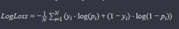
Where:
- N is the number of observations.
- yi is the actual binary outcome (0 or 1) for the i-th observation.
- pi is the predicted probability that the i-th observation belongs to class 1.
Okay, deep breath. This looks like a complicated function, but it actually isn’t that crazy once you apply an example. Let’s examine two hypothetical tournament matchups: 1 Michigan vs. 2 Houston and 3 Purdue vs. 6 Wisconsin. Our model says there’s a 0.75 chance the favorite wins in the first game, and the same in the second game. That makes pi 0.75 in the equation above. We can ignore the summation and 1/N for now, since all that means is that we’re going to take the average of the log loss for all of our samples. Looking at the equation now, the pattern becomes much clearer:
-(yi * log(.75) + (1-yi) * log(0.25)) = -(yi*-0.29 + (1-yi) * -1.39) = 0.29yi + 1.39(1-yi)
(For the math nerds out there, this is using the natural logarithm, not base 10)
The lower log loss is, the better. We can see that whether the penalty is 0.29 or 1.39 depends entirely on whether the favorite wins or loses (yi = 1 or 0).
Let’s say Michigan wins the first game, but Wisconsin upsets Purdue in the second game. The log loss for our model is then 0.29 for the first game and 1.39 for the second game. We average those scores to get 0.84 as our log loss for the set.
The thing about the logarithms is that as you get closer to zero, the magnitude of the output increases exponentially, see this picture of a graph where y = -log(x):
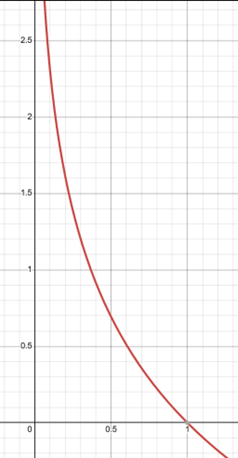
This means that the metric will severely penalize an overconfident wrong answer. For example, instead of predicting with 0.75 confidence that the favorite would win each game, let’s say the model predicted with 0.99 confidence that the favorite would win. The equation would be:
-(yi * log(.99) + (1-yi) * log(0.01))
-log(.99) = 0.01, so we do get a very small penalty if the model is correct. However, -log(0.01) = 4.61, or more than three times the penalty of our incorrect prediction above (1.39), despite being only 24% more confident in the outcome. The average log loss using the more confident predictions on our earlier scenario comes to 2.31, more than double our penalty above.
As a point of reference, a classifier that flips a coin to decide which team wins would have a log loss of about 0.693, so anything below that means we’re doing better than randomly guessing.
TLDR: Essentially, log loss not only rewards correctness, but accurate probability. It severely penalizes confidently wrong answers, encouraging models to not only predict correctly, but also predict with the right amount of confidence.
3. Tournament Points
I think after being so mathy, we deserve a fun one, right? As a treat? This one is even less scientific than accuracy and is mostly just for fun. Essentially, we ask the question, “if the models all filled out a bracket before the tournament started, how many points would they earn using the traditional bracket scoring system (i.e., 10 points for a correct pick in the first round, 20 for a correct pick in the second round, 40 for a correct pick in the Sweet 16, 80 for a correct pick in the Elite 8, and so on)?”
Essentially, if all of the models were in a single bracket pool, who would win? (It’s worth noting that this is perhaps the only time the prospect of models in a pool is not exciting to anyone but math nerds like me.)
3.5. Expected Tournament Points
This is exactly like the metric above, but with a twist. Instead of awarding points for correctly picking a given team in a given round, we multiply the points that would have been awarded by the probability that model gave that team of winning that round at the start of the tournament. For example, if the model gave Team A a 70% chance of winning the first round, and a 60% chance of winning the second round, then that means that the model thinks that Team A had a 42% chance of making it to the Sweet 16 at the start of the tournament. Accordingly, the model would earn 10 * 0.70 = 7 points for the team winning the first round, and 20 * 0.42 = 8.4 points for the team winning the second round.
Since the purpose of these probabilities was originally for use in generating tournament simulations, consider this metric to be the average number of bracket points a simulation generated by this model would earn.
I’ll be excluding Torvik’s projections, and chalk from this metric, since I only have Torvik’s projections from the games that actually happened, and so can’t generate a hypothetical round by round probability fairly, and for chalk, since we’re picking the higher-seeded team every time, the expected points and actual points would be identical.
Now, let’s meet our models.
The Contenders
1. MNPI
Our first model is one that you’re already familiar with if you read my posts from last year, so I will only briefly recap that model here.
MNPI is a linear regression model that takes a team’s raw-per game stats, and their simple rating system (SRS) score from basketball reference and applies a linear regression algorithm to output projected win probability.
Here are some of the quirks of this model, which is basically also a recounting of why I decided to try to branch out to different methods this year:
As mentioned before, the model operates on raw averages as inputs, rather than tempo-free data, which is less informative since it inflates the raw stats for high tempo teams (it does make the defensive numbers look better though, so maybe it was all canceling out).
The model did not take into account margin of victory or home court advantage when it was training or making its predictions. These are factors that are incorporated into advanced models like KenPom and Torvik, since they are extremely useful indicators for evaluating true team quality (a better team will win by more, and home/away is a huge difference in college basketball).
Finally, the way I was loading in training data meant the model double-trained on neutral site games. Not necessarily the worst thing in the world, but kind of an arbitrary method of artificially altering the training data. It truthfully wasn’t even because I wanted to account more for neutral site games since this was a tournament predictor. Without going into too much detail, the way I was loading in games just meant that this ended up saving me a lot of work at the time.
2. Resumetric
Our second model is something I coded in an effort to capture how good a team is, based solely on game results. The first thing I thought of to accomplish this was to code an Elo system (link). However, the problem with using an Elo system when I’m only training on one season’s worth of data is that the model wasn’t going to properly value early-season wins. Since all teams would be starting from the same baseline, the model would value Arizona’s season-opening win over Florida just as much as Eastern Michigan’s season-opening win over Georgia State. What I wanted was a model that would operate sort of like Elo but could retroactively give teams the proper amount of credit for their wins in the context of the entire season. The Resumetric attempts to do just that.
Without getting too deep into the weeds of the math (for those of you who like that kind of thing, this is a Bradley-Terry model: link), you can think of this model as doing what I specified above: measuring the quality of a team based on who they’ve beaten, who the teams they’ve beaten have beaten, and so on. It doesn’t account for margin of victory, or points scored, or any other stats. Only who you’ve beaten, and where you beat them (I did add a parameter to account for home/neutral/away).
Most resume metrics, like Wins Above Bubble are still using underlying predictive metrics to measure the value of each individual win. Not this metric. Now, is this a good change? I guess we’ll find out.
3. Minnow
Minnow operates much the same way that advanced predictive metrics, such as KenPom and Torvik, do. Again, sparing the mathematical and computational details, it calculates a team’s offensive and defensive efficiency (points per hundred possessions), and tempo (average number of possessions per team in a game played by this team) and adjusts for opponent quality, giving us adjusted offensive and defensive efficiencies, as well as adjusted tempo.
Using the efficiency metrics, we can subtract a team’s adjusted offensive efficiency from their adjusted defensive efficiency to get a net rating. A team’s net rating can be understood as “how many points per 100 possessions is this team better than the average D-I team?”
This relationship is linear, so if Michigan’s net rating is 39, and Ohio State’s net rating is 25, then Michigan is expected to be 14 points per 100 possessions better than Ohio State. To calculate the expected margin of victory, we therefore only need to know the expected number of possessions in a game between those two teams. That’s where adjusted tempo comes in.
To get the expected tempo in a game between two teams, I calculate:
ExpectedT = team1T + team2T - averageDivision1T
The reason the calculation works this way rather than just averaging the two teams’ adjusted tempo together is because my friend who majored in sports analytics told me to, since adjusted tempo is not a measure of a team’s average tempo, it is a measure of a team’s expected tempo against the average D-I team. If, for example, Michigan were to play Alabama, and Michigan’s adjusted tempo was 72 and Alabama’s adjusted tempo was 74, you wouldn’t expect the tempo for that game to be lower than 74, since that would mean Alabama would be expected to have fewer possessions against Michigan (a team that also likes to play fast) than they would against an average D-I team.
Once the expected tempo has been calculated, the net rating is distilled to points per possession, and then multiplied by the expected tempo (expected number of possessions) in order to get a predicted margin of victory.
I convert that predicted margin of victory into win probability by assuming a standard deviation of 10 (link)*, and calculating the z-score of that margin to get a win probability. For the non-statisticians among us, that translates to “how likely is a team favored by this many points to win a given matchup.”
*Yes, I know my model is almost certainly not as good as Vegas spreads, but it’s a pretty good starting point if you believe in the spread this method generates.
4. BranchyBrackets
Our fourth model is BranchyBrackets, a tree classifier that was trained on a team’s season long tempo-free stats (provided by Torvik), and the efficiency/tempo metrics calculated by Minnow, as described above.
As I’ve said before, I’ll spare the finer mathematical details, as this post is already almost a novel as it is, but conceptually, what separates this model from a linear regression algorithm like MNPI, aside from the differing inputs and the ability to account for home court advantage, is that as the name suggests, a linear regression algorithm can only associate input variables linearly.
If “x” were a numerical representation of how good a team is relative to another team, then a linear regression algorithm may come up with a prediction equation like:
x = 4 * team1_avg_points - 3 * team2_avg_points
It can’t, however, associate two variables with each other in any other way. That’s where a tree algorithm can offer a potential improvement. A tree algorithm naturally learns to associate different variables with each other when predicting outcomes. For example, it might see that team A is a good three-point shooting team, and team B gives up a lot of three pointers. That association might give team A a boost, and it’s something that a linear regression algorithm would not be able to learn on its own.
5. The Composite
Our fifth and final “model” is just the average odds for a given matchup, as generated by the four models listed above. This is just to see if there’s any benefit to a hybrid approach that incorporates the outcomes of my other models.
6 and 7. The Controls (Chalk and Torvik)
These two models serve as the controls in our experiment. The Chalk “model” is to see how my models compare to always picking the higher seeded team to win in your bracket, which is typically a very strong strategy, and so provides a good baseline for us to tell if we’re just outsmarting ourselves. In terms of probability, I’ll say that a Chalk model predicts that the higher seeded team will win with 99.99% certainty.
Torvik is kind enough to publish his historic pregame win probabilities for tournament games, so our other control is to compare our predictions to his, since his model is among the most respected in the industry, and so provides a good measuring stick for our models’ performance.
To begin making excuses in advance, I will note that the Torvik win percentages are calculated using up to date information, including information gained after the tournament began. My models don’t have that benefit, only training on pre-tournament data, so it’s not an entirely even comparison, but it should still be informative.
Predictions
Phew! We’ve covered all of our metrics and models. If you’d like to write down some predictions as to which models will do better, now is the time to do it.
I’m actually writing the first part of this post before I’ve finished coding the evaluation metrics, so as I write this, I’m as in the dark as you are about what the outcomes are going to be, so I’m going to write down some predictions too. If my eighth-grade science class taught me anything, it’s that every good experiment needs a hypothesis.
My own predictions are that of my own models, the ranking will generally go:
- Minnow
- BranchyBrackets
- The Composite
- MNPI
- Resumetric
I think that Torvik will slot in above all of my models, as there’s a reason his model is amongst the industry standard. Given how chalky last year turned out to be, I think that Chalk will slot in at second overall for accuracy and tournament points (maybe third or fourth for tournament points, since I know Chalk would have had an Auburn-Duke title game, so it’s going to miss out on a huge chunk of points there), but I also think that its log loss results will demonstrate why being confidently wrong can really drag down your numbers.
One final disclaimer before we dive into the results: only evaluating model performance based on one NCAA tournament (and a particularly chalky one at that) is objectively a terrible method for assessing overall quality. This is mostly for fun, and just to establish which models did the best at predicting last year’s bracket specifically. It would not at all be surprising to see a different order after this year’s tournament.
The Results
Accuracy
| Rank | Model | Accuracy |
|---|---|---|
| 1 | BranchyBrackets | 88.89% |
| 2 | Torvik | 84.13% |
| T3 | Resumetric | 82.54% |
| T3 | Composite | 82.54% |
| 5 | MNPI | 80.95% |
| 6 | Minnow | 79.37% |
| 7 | Chalk | 77.78% |
Log Loss
| Rank | Model | Log Loss |
|---|---|---|
| 1 | Branchy Brackets | 0.3494 |
| 2 | Resumetric | 0.3628 |
| 3 | Composite | 0.3753 |
| 4 | Minnow | 0.3846 |
| 5 | Torvik | 0.4047 |
| 6 | MNPI | 0.4383 |
| 7 | Chalk | 2.0468 |
(For context, 0.693 is the log loss of a random classifier)
Tourney Points
| Rank | Model | Points |
|---|---|---|
| 1 | Branchy Brackets | 1760 |
| 2 | Resumetric | 1740 |
| 3 | Composite | 1630 |
| 4 | Torvik | 1270 |
| 5 | Minnow | 1140 |
| 6 | Chalk | 1090 |
| 7 | MNPI | 1060 |
Weighted Tourney Points
| Rank | Model | Weighted Points |
|---|---|---|
| 1 | Resumetric | 1114.85 |
| 2 | Branchy Brackets | 1079.35 |
| 3 | Composite | 955.24 |
| 4 | Minnow | 904.86 |
| 5 | MNPI | 764.66 |
Analysis
First, let’s address the elephant in the room. My model from last year did pretty poorly when compared to the other models. It was pretty consistently the worst of the non-control models, only barely edging out Minnow in accuracy to not be ranked last of the non-controls in every category. Although it’s a small, biased sample size, the results do seem to support my move to look for better methods this year.
Speaking of Minnow, I feel like it was the real letdown of the new models. I felt very cool when coding it, and the math was so clean and relatively simple. As my pre-evaluation prediction revealed, I had high hopes for it. Those expectations were not met, as Minnow was more or less the second worst non-control in every metric (aside from accuracy).
The Composite did exactly as I expected, placing squarely in the middle of the non-controls, finishing third or tied for third in every metric, which makes sense for all kinds of reasons.
The two shining stars of this experiment were clearly Branchy Brackets and Resumetric. Resumetric in particular surprised me since I expected it to be the worst model, but it ended up being in a clear-cut top two.
Now, both of these models got where they were by being extremely confident in answers that turned out to be correct. See below for the round-by-round probabilities projected by each for the top four seeds:
Branchy Brackets:
| Team | Make R32 | Make Sweet 16 | Make Elite 8 | Make Final Four | Make NCG | Win Championship |
|---|---|---|---|---|---|---|
| Florida | 0.9938 | 0.8892 | 0.741 | 0.6152 | 0.4813 | 0.3259 |
| Duke | 0.9903 | 0.939 | 0.7856 | 0.6577 | 0.3529 | 0.1933 |
| Auburn | 0.9988 | 0.9521 | 0.7859 | 0.6089 | 0.2712 | 0.1469 |
| Houston | 0.9885 | 0.8671 | 0.7019 | 0.4825 | 0.2689 | 0.1171 |
Resumetric:
| Team | Make R32 | Make Sweet 16 | Make Elite 8 | Make Final Four | Make NCG | Win Championship |
|---|---|---|---|---|---|---|
| Florida | 0.9971 | 0.9436 | 0.8757 | 0.798 | 0.5618 | 0.4117 |
| Auburn | 0.9985 | 0.9071 | 0.7753 | 0.6386 | 0.3132 | 0.2013 |
| Houston | 0.9967 | 0.8835 | 0.7683 | 0.4778 | 0.2938 | 0.1183 |
| Duke | 0.9937 | 0.8532 | 0.7058 | 0.4444 | 0.2283 | 0.0821 |
As you can see, these two metrics were extremely confident in the top seeds in last year’s tournament. Resumetric having Florida at 41% odds to win the tournament before it even started is, quite frankly, insane behavior, even if it worked out this time. In a small sample size like a single tournament, being right about a huge gamble like this can really pay off for these metrics, but in a less-chalky tournament, the models that hedge their bets might get rewarded more, and perhaps over time, models that give lower confidence thresholds will actually prove to be better than models that take big swings like Resumetric and Branchy Brackets.
Alternatively, it could be the case that I’ve solved college basketball, and these are truly just elite predictors for the long term, but I’m going to make my own prediction and put those odds at less than 1%.
As we march through future years, I’ll keep a running tally of moving windows of averages for model performance to account for larger sample sizes.
As a final thought, all of my models performed favorably relative to the controls. Chalk did very poorly in log loss, as I expected, but what I didn’t expect was my models performing better than chalk in every performance metric (except tourney points, where only MNPI fell behind Chalk, and only by 30 points!) Torvik did pretty well, as expected, but four of my five non-control models performed better than Torvik in log loss, which as I stated before, is likely the best metric for measuring model performance. Now, that isn’t to suggest that my models are better than Torvik’s, in fact, I want to dissuade you all of that notion immediately. Think of it like Wisconsin beating Michigan earlier this year. Did they win? Yes. Were they the better team for that game? Well, they scored more points than us, so yeah. Are they the better team overall? Absolutely not, and we have a large body of work from both teams to show that’s the case, including a victory in the rematch for the good guys. We’ll see how the rematch goes for my models this coming tournament. It still is an encouraging sign that my models can hang with the best of them for a tourney.
Thank you to everyone who read to this point. I know this was a super long post, and as long as it took to read it, you can only imagine how long it took to code, research, and write everything that went into this personal project.
I intend to use these models again for the upcoming tournament, so keep your eyes peeled for another (much shorter) post from me early next week after the bracket is revealed concerning their predictions for the upcoming tournament.